Pages

Saturday, October 29, 2011

Color on the Walls!


Positive/Negative Space Design

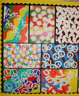
After a full quarter of the year, my walls are full of color again. My Art 1 students are mostly 9th and 10th graders with some 11th and 12th graders too. The project I'm sharing this week is an Art 1 project from the first quarter.

This project teaches students about Positive and Negative Space and how to create a good composition. It is a good way to teach my beginners to pay attention to both the negative space (background) and the positive space (the subject).

Supplies Needed:
Drawing Paper - We used 12 x 18 inch
Colored Pencils or Markers
Pencil
Tag board or thick cardstock for patterns
Scissors

The students are asked to choose one simple shape, with interesting edges, to repeat all over the page to create a pattern. Some students chose to use 2 shapes or variations of one. They could draw their shape onto a piece of cardstock or tag board and cut it out to trace onto their page. After drawing the Positive shapes onto the page, they were to color the Negative Space (background).

Steps for design project:
1. Draw and cut out the shape out of cardstock or tagboard.
2. Trace the shapes onto the drawing paper.
    Overlap the shapes to create interesting positive and negative spaces.
2. Erase the lines where the shapes overlap.
3. Add color to the background with colored pencils or markers. (We used colored pencils)
    The background could be one color or they could choose the colors and patterns to enhance their design.
Tip: When adding color using colored pencils, make sure you use medium to heavy pressure with the pencils, to cover the white of the paper. This will get a good contrast between the white of the positive space and the color of the negative spaces. The design will stand out much better with strong color.
Option 2: Another option is to use markers to get a strong color contrast. 

I always get some nice designs from this project; this year was no exception.  This photo is only half of the artwork that I chose to display.


Mrs. Macre♥Art     

Thursday, October 13, 2011

Art 1 Line Designs Lesson

LINE - Designs 


Bulletin Board with Examples

Art 1 at the High School Level is set up for students who have had little, if any, art background.  Some students have had some classes in art along the way, but many do not.  So my class starts out studying about the elements of design (art).  The first one that we study is Line.  So we start out drawing creative line designs.  This project is like giving a student permission to doodle! But it sad to say that many students cannot even doodle! Some have lost their ability to think creatively.  But I am also happy to say that many students are wonderfully creative.
Elements of Design
I start out the lesson showing the students the bulletin board, shown above, and discuss the different kinds and variations of lines.  We also talk about how to get started, in case you are completely blank with no ideas at all.  They also are required to included some color.  When I first started doing this projects, I only required black and white. But now we add some color to go with the black pen.  We use the new black sharpie pens to draw/doodle with.  Then they go back and add some color.  The others are examples of the project before we added color.

2017 UPDATE: This project is very similar to Adult Coloring Pages that are so popular today. Teachers can teach their students how to create their own coloring pages. Go a step further and have your students scan them into a computer and print copies for other students to decorate and color.


Small group of line designs as displayed in the classroom. 


Mrs. Macre♥Art    

Sunday, October 2, 2011

Update on Abstract Letter Designs


After this past week of Homecoming and dress up days, I'll be happy to get back to the business of classwork. It was very limited in some classes due to sign painting and the excitement of the dress up activities. Our door did not win the competition, but its okay.  The students were a little upset, but they were proud of our door decoration.
So here are some of the results of the Abstract letter designs that I showed works in progress a couple of weeks ago. They were to choose a theme and take words that are related to that theme and create an abstract/semi abstract composition that illustrates that theme.

Hayley and Hannah's artwork
Samantha and Courtney's artwork
Ta'chun and Brooke's artwork

Example of Themed Abstract Art
(partially incomplete bottom left corner)

Close up of Example
This project is done in my advance art class. Next I will be posting Art 1 and Art 2 projects.  Thanks for looking. I hope you enjoy the students artwork.


Mrs. Macre♥Art