Saturday, December 10, 2011

One Point Perspective Drawing

Colored Pencil Version by Madison
1 point perspective assignment
Teaching 1 Point Perspective
High School Art

This lesson is a refresher lesson for my 2nd year Art students. I teach 2 point linear perspective in beginning Art. It seems backwards, but I found that teaching 2 point perspective step by step in Art 1, teaches them the basics of perspective with good results. In the fall of 2nd year Art I use this Room Project with my Art 2 students using 1 point perspective. This project shows the students how perspective can be applied to drawing everyday objects.

Supplies Needed: (+ a few tips)
Drawing Pencils
Erasers
Sketchbook
Clear T-square
+Tip: I like the clear, so they can see their
previously drawn lines.
Colored Pencil Classpack:
+Tip: I like to use the classpack because it becomes the student's responsibility to return their colored pencils back to the correct spot in the box, which helped eliminate the misplaced colors. When using individual boxes, all of the colors did not seem to stay in each box.

Drawing Assignment
Their assignment is to include:
-At least one door
-At least one window
-2 pieces of furniture
-A wall decoration
-A floor decoration (tile, rug, wood floor, etc)
-A ceiling fixture (lighting, etc).

Step 1: They were introduced to 1 and 2 pt. perspective in Art 1, so they have some experience with the linear perspective techniques.  But even with that experience, they must have a little refresher assignment. I demonstrate to them how to change 9 squares into 9 cubes to by using 1 vanishing point in the center of the page. This can be done any way you choose to teach one point perspective.


Step 2: After they practice that assignment, where I also teach them to use a T-square, they start drawing their rooms.  I show them samples of rooms drawn by former students, to get ideas for types of rooms, furnishings, and other ideas that they could create.

Step 3: Students use their sketchbook to sketch ideas and to practice drawing difficult details.

Step 4: Students transfer their ideas onto the final drawing paper, being careful to draw with a light touch. Many lines will be erased, so drawing lightly is important. Heavy lines are difficult, if not impossible, to erase. Check perspective before proceeding to Step 5.

Step 5:  Add color or value to the drawing.
Sometimes I give them a choice between using colored pencils or just to use pencils to add shading to their drawings to create a value study with their graphite pencils. Some students are better with pencils and some are better with color. One thing we need to work on is adding values with the colored pencils.  That is a little difficult to do with student grade colored pencils.  
So here are some of the results from the assignment with both the value studies and colored pencils.

Colored Pencil

Graphite Pencils

Mrs. Macre♥Art    

Saturday, November 19, 2011

National Contest Winners

The DAR organization sponsors an art contest, called the JAC contest, each year with a patriotic theme.  My Advanced Art classes just completed their projects for this year and will be delivered this weekend.  So I thought I would share a photo of my students who had projects from last year that won 1st, 2nd or 3rd place,  all the way up to the District and National level.  They are very proud of their achievement.  They had to win 1st place to get to the National competition.
This patriotic theme based assignment really challenges my students to think about historical and social issues in a creative way.  The students really work hard at coming up with their idea and how to tie their idea into the theme.  Its a challenge, but I think its a really good experience for the students.
There was another national winner, but she graduated and is away at college.


Mrs. Macre♥Art    

Saturday, October 29, 2011

Color on the Walls!


Positive/Negative Space Design

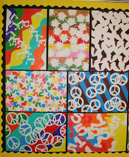
After a full quarter of the year, my walls are full of color again. My Art 1 students are mostly 9th and 10th graders with some 11th and 12th graders too. The project I'm sharing this week is an Art 1 project from the first quarter.

This project teaches students about Positive and Negative Space and how to create a good composition. It is a good way to teach my beginners to pay attention to both the negative space (background) and the positive space (the subject).

Supplies Needed:
Drawing Paper - We used 12 x 18 inch
Colored Pencils or Markers
Pencil
Tag board or thick cardstock for patterns
Scissors

The students are asked to choose one simple shape, with interesting edges, to repeat all over the page to create a pattern. Some students chose to use 2 shapes or variations of one. They could draw their shape onto a piece of cardstock or tag board and cut it out to trace onto their page. After drawing the Positive shapes onto the page, they were to color the Negative Space (background).

Steps for design project:
1. Draw and cut out the shape out of cardstock or tagboard.
2. Trace the shapes onto the drawing paper.
    Overlap the shapes to create interesting positive and negative spaces.
2. Erase the lines where the shapes overlap.
3. Add color to the background with colored pencils or markers. (We used colored pencils)
    The background could be one color or they could choose the colors and patterns to enhance their design.
Tip: When adding color using colored pencils, make sure you use medium to heavy pressure with the pencils, to cover the white of the paper. This will get a good contrast between the white of the positive space and the color of the negative spaces. The design will stand out much better with strong color.
Option 2: Another option is to use markers to get a strong color contrast. 

I always get some nice designs from this project; this year was no exception.  This photo is only half of the artwork that I chose to display.


Mrs. Macre♥Art     

Thursday, October 13, 2011

Art 1 Line Designs Lesson

LINE - Designs 


Bulletin Board with Examples

Art 1 at the High School Level is set up for students who have had little, if any, art background.  Some students have had some classes in art along the way, but many do not.  So my class starts out studying about the elements of design (art).  The first one that we study is Line.  So we start out drawing creative line designs.  This project is like giving a student permission to doodle! But it sad to say that many students cannot even doodle! Some have lost their ability to think creatively.  But I am also happy to say that many students are wonderfully creative.
Elements of Design
I start out the lesson showing the students the bulletin board, shown above, and discuss the different kinds and variations of lines.  We also talk about how to get started, in case you are completely blank with no ideas at all.  They also are required to included some color.  When I first started doing this projects, I only required black and white. But now we add some color to go with the black pen.  We use the new black sharpie pens to draw/doodle with.  Then they go back and add some color.  The others are examples of the project before we added color.

2017 UPDATE: This project is very similar to Adult Coloring Pages that are so popular today. Teachers can teach their students how to create their own coloring pages. Go a step further and have your students scan them into a computer and print copies for other students to decorate and color.


Small group of line designs as displayed in the classroom. 


Mrs. Macre♥Art    

Sunday, October 2, 2011

Update on Abstract Letter Designs


After this past week of Homecoming and dress up days, I'll be happy to get back to the business of classwork. It was very limited in some classes due to sign painting and the excitement of the dress up activities. Our door did not win the competition, but its okay.  The students were a little upset, but they were proud of our door decoration.
So here are some of the results of the Abstract letter designs that I showed works in progress a couple of weeks ago. They were to choose a theme and take words that are related to that theme and create an abstract/semi abstract composition that illustrates that theme.

Hayley and Hannah's artwork
Samantha and Courtney's artwork
Ta'chun and Brooke's artwork

Example of Themed Abstract Art
(partially incomplete bottom left corner)

Close up of Example
This project is done in my advance art class. Next I will be posting Art 1 and Art 2 projects.  Thanks for looking. I hope you enjoy the students artwork.


Mrs. Macre♥Art    


Tuesday, September 27, 2011

Time for Homecoming!

Homecoming Door Decorating Contest
Art 1st Period Decorated My Door

Doors are supposed to be judged tomorrow. I hope to be able to report that we won...again. But we'll see! 
More homecoming activity photos to come. 


Mrs. Macre♥Art    

Saturday, September 17, 2011

Abstract Letter Designs


It was a busy week at school, but I just wanted to post a few things that are in progress in the artroom at BHS. I will post final projects as soon as I can get photos of the finished works.  This project is a design project that involves choosing a theme and using words and abstracting the words by overlapping them, placing them in different directions, and then painting the designs on canvas boards.


Mrs. Macre♥Art   

Monday, September 12, 2011

Value Study of the Sheet


So here are some of the results of the value study of the sheet from the first of school along with a couple of pictures of students hard at work. I've been so busy, I haven't had time to add more pictures of projects. But I have pictures, I just need to get caught up on the dreaded 'paperwork' (grading), and will be posting pictures of projects soon.  For now, here is my Art 3 class working on their value studies of the sheet. (below)


Sunday, September 4, 2011

Colorful Portfolios...

...to hold the artwork that will be created this year have been made by my 2nd, 3rd, & 4th year art students.  Each year I begin the semester by giving them a few days to make and decorate their portfolios.  My only requirement is that they have their name on it and that they create a design. Some students really like to spruce it up. Shown here are few examples of their portfolios. We just use poster board, paint or markers, and yarn to tie the poster boards together and the students add their creativity.  Next I will be working with Art 1 to create their Portfolios.


Mrs. Macre♥Art    

Saturday, August 27, 2011

Drawing from Life with High School Students


Beginning of School

After two weeks the High School Art Room is beginning to look more like my typical art room. Lots of projects are in progress, art supplies are out, students are beginning to relax a little. I've been trying to stay caught up with paperwork, but I am already sick of that! If I could just teach art and not do 'paperwork', I think this would be the 'ideal' job! So far, my classes have been great and I am looking forward to a wonderful year. 

Value Studies

Supplies Needed:
Drawing Pencils - 2B-6B
White Drawing Paper - 18x24
White Sheet or piece of fabric
Lamp to Shine on the Fabric

I usually start off my Art 2 and 3 with a value study drawing.  I hang a sheet and another piece of fabric (to give them a choice) and place a lamp to shine onto the fabrics to enhance the highlights and shadows. I also place samples of drawings that I have done or former student drawings on the wall for them to see how the drawing should fill the page and the range of values that is possible when drawing something that is only black and white. The goal is for the students to learn how to add values to add depth to their drawings and to give them more experience in drawing from life.  You can see some of my students' work from this project here: Value Studies


 Mrs. Macre♥Art    

Monday, August 15, 2011

First Things First...

...is what we call our First Day of School. That was today. I spent part of my weekend getting my classroom ready for today, but I finally got it done and today went smoothly. The first day is important because we invite parents of our students to go through our students schedules with them. It was a shortened schedule, but we are able to introduce ourselves to the parents and tell them what our expectations are for the year. We started this program several years ago to get more parents involved and informed about what the High School is all about. And it sure does help to get the parents involved and understand what we do!

In the future, I have to remember to take photos in my classroom. I was so busy today, I didn't take a photo, so I am including a photo of the lobby of our school with an art show from a couple of years ago. (I have to include a photo!)

So with the first day over...I'm exhausted and hope that the rest of the week goes smoothly.
Hope everyone had a great first day of school!


Mrs. Macre♥Art    

Tuesday, August 2, 2011

Drawing/Painting Grid Portraits

Grid Self Portraits
Time to get ready...

...to go back to school....already? It seems like just a couple of weeks ago I was celebrating the beginning of summer! Classes do not start for 3 weeks, but there are supplies to order, workshops to attend, and my classroom has to be put back together.  The maintenance department came through sometime in the last 2 weeks and waxed my concrete floor (looks great!) but now I have to put everything back into place.  They move things out to wax and stack things on tables, so it takes a little time and muscle.  I want to get organized before school starts, so I have some work to do!

Grid Self Portraits - Chuck Close Style

I thought I would share a project that I have been doing with my Art 3 and 4 classes for a few years now. This pair decided to make their portraits connect, but they are 2 separate paintings. The photo above is the end project (2 canvases are being held together by the students).  Below is the photo that I took of them.  After they drew the grid on the 2 separate canvases they each drew their own portrait, using the grid method.  Then they painted their grid portraits using their own techniques. But the emphasis was using patterns like Chuck Close does on his grid portraits.  So in the bottom picture, you can see the two canvases that are in progress.  On the parts that are unpainted, you can see the grid that is drawn on the canvas.  (Click on the picture to see it larger to see the details.) I will post more grid portraits in the future. We do some type of grid portrait each year.  The students seem to really enjoy them because they can get a good likeness of the person that they are drawing.

Check back for more details and instructions on this project.

More to come...

Photo Reference

Work in progress

Have a great year!


Mrs. Macre♥Art    


Sunday, July 3, 2011

Letters from Students...

...make the stresses of the school year become a distant memory.   A few years ago, I asked my Art 3 and 4 seniors to write/create a letter to me about their art experiences or whatever they wanted to tell me...good or bad.  I enjoyed reading them so much that I have started doing this with all of my seniors and as well as the Art 2 students at the end of each semester, to have them reflect on what they have accomplished throughout the semester.  The letters that I get from my students at the end of the year, really make me remember why I teach.  If you are new to teaching, I would highly recommend that you think about doing this.  I wish that I had started doing this years ago.  Besides making a wonderful collection of memories, it could even be an end of the year project.  The colorful ones in the photo had some illustrations with them and are hanging on my bulletin board. (The heart was painted by a student who didn't take art, but wanted to come in and paint something before he graduated.)   I would recommend that they are small enough to fit into a 3 ring binder if you want to save them.  Letter size is large enough for the student to write a short letter and add some illustrations so you can keep them organized in the binder by year.

Hope you are having a great summer break! 
Mrs. Macre♥Art    

Thursday, June 23, 2011

Crayola Marker Update...

After I wrote my last post, I wrote an email to Crayola about their change in the markers.  I received an email response today.  It sounds like they have gotten the message, so hopefully I can continue to use Crayola markers!

Here is their response:

"Thank you for your recent inquiry.

During our 2010 back-to-school season, we introduced Crayola(R) markers made from plastic bottle caps.  The combination of all different bottle caps resulted in black marker barrels.  This initiative increased the amount of recycled plastic that could be used, giving a second life to more than 1 million pounds of plastic bottle caps.

We greatly value consumer input like yours, and in response, are now introducing our 2nd generation recycled marker with a white barrel and colored graphics, for ease in matching the color with the cap.  Recycled material will continue to be used to manufacture the black end plugs.  Depending on store inventory, you could begin to find the white barrel markers on store shelves by the time you head back to school.  Additionally, this year, we will expand our solar farm allowing a half-billion Crayola markers made in the USA to be produced using power from the sun!

Again, we appreciate your feedback and the opportunity to make changes to better fulfill our consumers' needs.   Best wishes for a colorful future!

Colorfully yours,
   xxxx (She did sign her name...just don't think that is necessary to post here)
Consumer Affairs Representative
CRAYOLA"


Mrs. Macre♥Art 

Wednesday, June 22, 2011

Change is not always good...Crayola...are you listening?

I love Crayola markers, but I have a complaint.  I may have to write an email complaining about this, which I usually don't complain about a product...I usually just find a replacement.  I may eventually have to do that, but I am going to let them know before I do. So, if you are not aware of this change, Crayola apparently is going green with their Crayola markers.  I read about this in another art teacher blog, which I did not know, until I realized that I had already received some of these 'green' markers.  (See the pictures and explanation below.)

Two Classpacks of Crayola Markers
put together to hold all of the colors.
Some of the colors are displayed on the lids.
I have used Crayola marker classpacks for many years in my high school art class and I love the box that they come in. It allows for me to organize the markers that come in the box, plus add more colors that come in other packages, like the Tropical and Bold colors.  Recently I have added the Multicultural classpacks to my collection of colors for my students to chose from.  The Tropical package has the sky blue marker that is always the first color that runs out.  So, if I could talk to the makers of Crayola markers, I would ask them to add Sky Blue to the Classpack, or start selling them individually. (If they do, I'm not aware of it.)

Crayola Blue Lagoon
Always run out of these!
When using the markers for a current class project, I put two boxes together on top of the cabinet beside my desk, where I can keep an eye on them throughout class time. Students can easily get the colors that they need at the beginning of class and easily put the markers back in the correct place in the box when they are finished or at the end of class. Most of my students are very good about putting them back in the correct spot and aiming in the correct direction, but I straighten them up a little at the end of each class.  It sounds obsessive, but they can get unorganized very quickly if I don't keep an eye on it.  Finding the correct color quickly is important.  Class is only 45 minutes long, so we have to have a routine to get supplies out and cleaned up and still have time to get to the fun stuff!
The 'Green' markers stayed in a box this year.
When I read about Crayola changing their markers to go green, I thought it had to do with the box being a little smaller.  But, unfortunately, I found out that they have changed the actual markers to a black color for all of the colors in the classpack.  I bought an extra classpack of markers last year, so I had a package with the regular markers.  But then I realized that I also had a package with the new markers.  At the beginning of the year, when I opened the box with the black markers, I put the black markers in a box to use later, because I still had lots of good markers from last year, thank goodness.  Then I started wondering how this will affect my marker organization method.  And realized that it will not work at all.   So I took some pictures of the new black markers to compare what they look like and how easy or difficult it will be to match the correct lid to the correct marker color.  It is not easy to do with some of the darker colors.  Knowing my students, there will be mismatched markers, which will be a headache, not just for me, but for the student who picks up a blue marker, expecting to blue color to go on their paper and will be disappointed and mad when that student realizes that it is actually a black or brown marker!  The only two markers that are obvious are the orange (that actually looks red) and the yellow.  Yes, there is a name of the color on the side of the marker, but it is the same color as the rest of the marker. No identification of color on the marker itself.    I hope that Crayola will listen to the people who purchase these supplies.  I understand that many teachers will be switching to another brand.   I don't understand how a black marker is going green.  If that is 'greener', then they need to put the matching color on the marker.  If not, then they may be losing a lot of business.
The darker colors do not look like the color they should be.
Without the caps on them, they are difficult to identify.


They all look black to me. 


This summer, as I make out my supply list and order for next school year, I need to decide if I want to switch brands or try to work out a new system with these black markers. If any art teachers have any suggestions, I would love to hear from you.


Mrs. Macre♥Art   

All That Jazz ~ District Fine Art Show

High School Art
Our District had another successful Fine Art Show in April.  We call it 'All That Jazz'...because it is not only Art from the Elementary level up to the High School level, but it is also choir performances from all levels, band performances from all levels, and it is even catered by our own Food Service program that teaches students about preparing, serving, and other aspects of the business side of working in the food service industry. I posted a few of these photos on my own Art Journal Blog, but now that I have this new blog for teaching side of my Art Life, I will share on this blog.

High School Art 2

High School Art 1

Middle School Art

Middle School Art

Middle School Art 

Intermediate School Art


Elementary Art

Elementary Art

Mrs. Macre♥Art